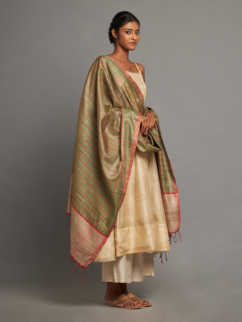
Knowing how to choose kurta colors for men based on their skin tone comes in handy at some point. Read more to know how these tones can complement your skin.
Learn More
Drawer menu

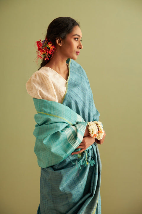
Certain sarees look refined even without heavy embroidery. It is rarely about embellishments. It is often about restraint.
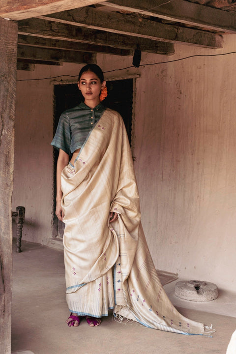
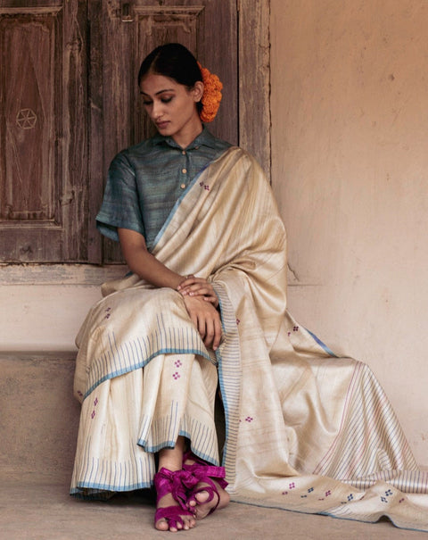
Muted tones, and especially pastels, carry a quiet authority. They invite attention, and in a room full of bright and dramatic sarees, pastel sarees stand out because they do not compete.
After all, luxury is rarely loud.
Refinement starts with a balance. Bright colors are bold and can be striking, but pastel saree colours calm the visual field and let the weave and texture take the focus.
When color is muted, the fabric becomes more visible. In elegant pastels, details like the drape, the fall, and the sheen are more visible.
Pastel saree colours are expensive because they shift the focus from the spectacle to the craftsmanship.

The fabric and the colors must be considered together.
In high quality silk sarees, the light is absorbed by the fabric rather than reflecting the light harshly. So rather than glare, the fabric creates a depth. The gentle richness of silk is complemented by the softness of pastel saree colors.
On the other hand, fabrics of poorer quality can make light colors appear to be leafless.
This is where the difference between handloom and powerloom fabrics comes into play. Handloom fabrics can prevent the leaf appearance of lighter colors by adding some depth to the colors.
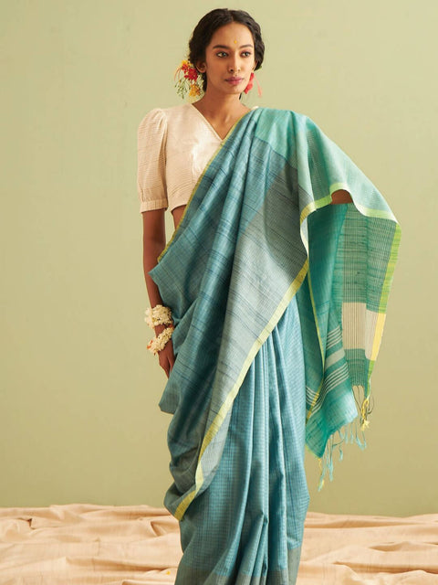
Pastel colors of sarees tend to photograph well in comparison to other colors. In daylight, vibrant colors tend to appear harsh and muddy. The pastel saree colors, in response to the light, provide a gentle, gradual response.
When in the presence of light, pastel saree colors:
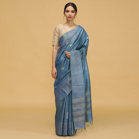
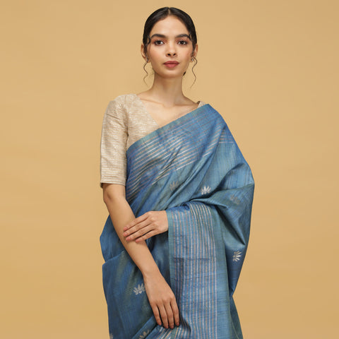
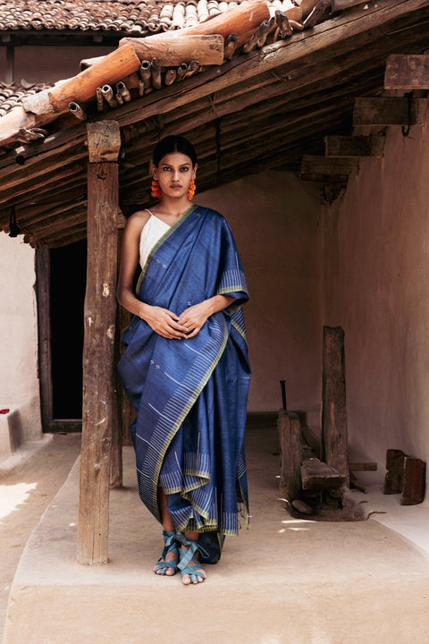
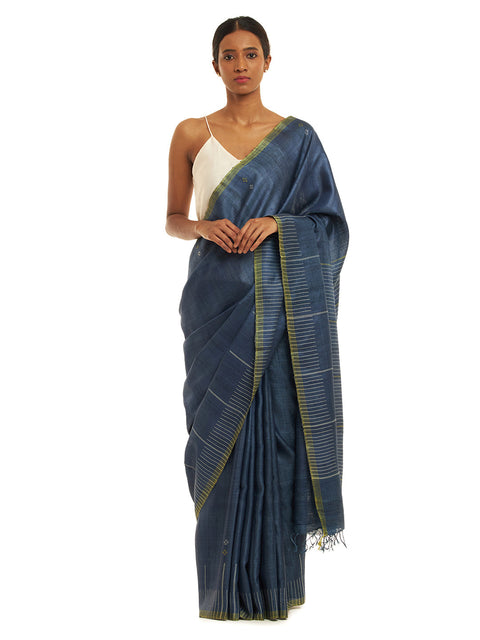
An example is a blue handloom saree, which is polished and appears loud in images. In the camera and in person, the softness appears well.
When pastel colors of the saree appear, the quality of the fabric has some effect.
Yes, and that is one of their many advantages.
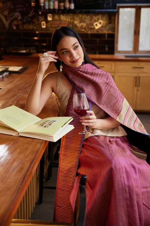
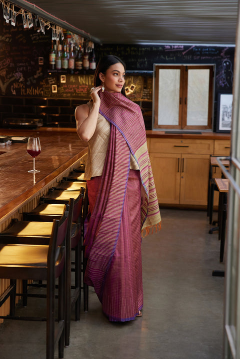
In formal scenarios, pastel sarees exude quiet sophistication, and for more laid-back occasions, they can work for a casual saree look.
The secret is in the styling:
For neoprene-type fabrics, a pastel saree is a perfect match, as they are not overpowering and will create the desired look for the occasion.
With less color, the weaving becomes the focal point.
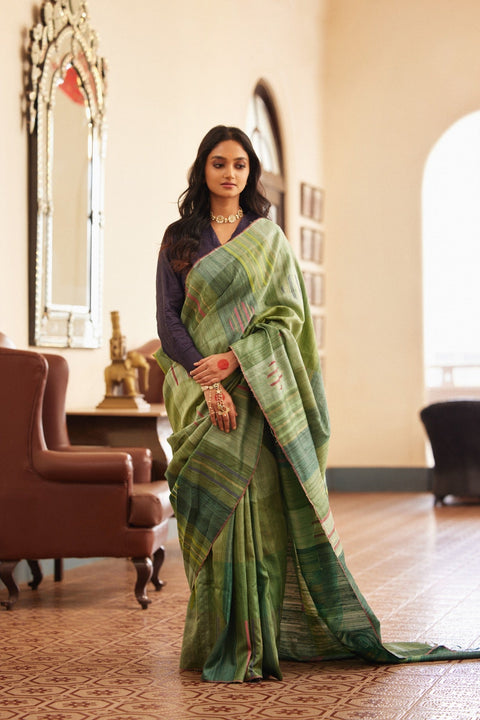
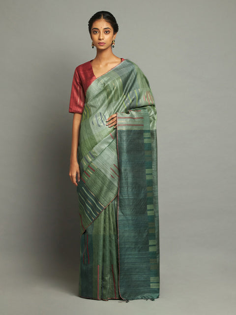
The texture in a handloom kosa silk saree in a faded colour is apparent without anything distracting or overwhelming the eye. The border looks more defined, and the pallu appears to move. Each element adds to the overall composition.
Muted tones work as a background and allow the quality of the weave to shine. The confidence in the quality of the fabric shows and is more impressive than the use of intricate embellishments.
Pastel sarees are more about the quality than the quantity.
A little bit of everything; less is more.
Accessories that work best include:
Pastel sarees work well with accessorising to complement more. With the right accessories, one can achieve more. The focus should remain on highlights.
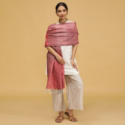
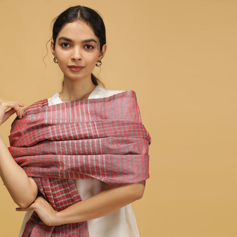
Pastels are a colour range, not a colour category. Soft colours are a range; they include muted corals, dusty rose, powder blue, and soft lilac.
When used with the right undertone, pastels are not likely to wash out the skin.
Pastel colours are soft, allowing the skin to show through.
It's more than money; expense is about impression. It's about how they make the consumer feel.
Pastel sarees exude:
Sarees in pastel colors favor restraint and shy away from excess. In a crowded field of competing elaborate color combinations, the choice of confection shows focus.
Pastel colours speak expensive because their thinking is focused on the saree. It is about the quality of the fabric, the way it falls, and the proportions of the saree, and not about cheap embellishments. Well-made fabric and a considered drape in combination with understated colors, in fact, speak design.
With a little confidence, luxury doesn’t have to shout and speak. Sometimes, it stands still and lets the quiet do the talking.
Yes. Muted pastels can look extremely refined for daytime weddings and receptions, especially when paired with structured draping and minimal jewellery.
Not usually. Because they rely on softness rather than dramatic contrast, pastel shades tend to remain relevant across seasons.
Store them away from direct sunlight, dry clean when required, and avoid harsh detergents to preserve the subtle tone.
Yes, especially when styled with richer accessories or textured weaves. Pastels can feel festive without appearing overwhelming.
Neutral tones, soft metallics, and slightly deeper versions of the saree shade often create the most balanced look.