

You unzip the suitcase the morning of the wedding and pull out a saree that looks nothing like the one you packed. Sharp fold lines run across the pallu. The border has a crease so deep it won't sit flat even after an hour of steaming.
This is the moment most saree packing tips floating around online fail to prevent, because they treat every silk saree the same way.
They aren't the same. And the fix starts with understanding why silk behaves the way it does in a suitcase.
Should You Fold or Roll a Silk Saree?
Not every silk saree should be packed the same way. The right call depends on weight and weave. The Tissue-Interleave method is where most saree packing tips get vague.
Here's the exact placement that actually protects the fabric.
Lay the saree flat, right side down, on a clean surface.
Smooth out any existing creases by hand before you fold anything.
Place one sheet of tissue paper at the pallu, where the pleats are deepest.
Fold lengthwise along the saree's natural pleat lines, not new ones.
Slide a second sheet of tissue along the border, where zari or embroidery sits.
Roll or fold the full length based on the weight rule above.
Slip the finished roll or fold into a breathable cotton bag, never plastic. Plastic traps moisture and can cause the colour to shift over a long trip.
Pack a Small Saree Emergency Kit
Tissue paper solves the fold. It doesn't solve everything else that can go wrong between home and the venue.
Safety pins: for a pallu that won't sit right or a pleat that loosens mid-event
Fashion tape: keeps the pallu in place without needing a pin near delicate zari
A small stain remover pen or wipe: for oil or food marks that happen at the function itself
A compact sewing kit: a loose thread or a small tear at the border is easier to fix on the spot than to explain later
A travel-size wrinkle spray: not a substitute for good packing, but useful for last-minute touch-ups before you're dressed
Blotting paper: for humid destinations where sweat or moisture near the blouse edge can transfer onto the saree
Keep all of this alongside the saree, not scattered across your suitcase. When something goes wrong an hour before the event, you don't want to be searching for it.
Does Your Luggage Choice Matter Too?
The suitcase itself plays a bigger role than most people account for.
Hard-shell luggage holds its shape under weight, so the middle layer where your saree sits stays flat instead of bowing inward when the case is stacked or squeezed into an overhead bin
Soft-sided bags flex more, which means more pressure can transfer through to whatever's packed inside, saree included
A structured cabin bag is worth using if you're travelling with just one or two sarees for a short trip. It sees less handling than checked luggage and keeps the saree closer to how you packed it
Avoid packing the saree in an outer or side pocket. These compress the most during transit and rarely stay flat
If you're choosing between two suitcases for a trip built around a wedding, the one with a firmer shell is usually the safer bet for anything silk.
Packing for Multi-Function Weddings
If the trip covers more than one function, sarees for mehendi, sarees for haldi, sangeet, and the ceremony itself, packing every saree the same way in one pile makes the morning of each event harder than it needs to be.
Pack by function, not by saree type: Group each saree with its matching blouse, jewellery, and any dupatta or stole for that specific event.
Label each bundle: Use a small tag or sticky note, especially if you're carrying four or five sarees for a multi-day wedding.
Pack the earliest function's saree closest to the top: This is essential so that you don’t end up unpacking everything the morning of mehendi to find it.
This isn't about complicated organizing. It just saves you from unfolding and refolding sarees you don't need yet, which is its own source of unnecessary creasing.
Packing for Humid vs Dry Destinations
Climate changes what "creasing" actually looks like at the other end, and this is something almost none of the standard saree packing tips account for.
Humid destinations (coastal weddings, monsoon travel): silk absorbs moisture from the air, which softens fold lines but can also cause the fabric to feel limp or slightly sticky. Pack an extra layer of tissue and unpack the saree the moment you arrive, so it isn't sitting damp in the bag.
Dry destinations (hill stations, winter travel): fabric holds its fold lines more stubbornly in low humidity. A light steam on arrival works faster here than in humid conditions.
If It Still Creases on Arrival
Even with careful silk saree travel prep, a long journey can leave marks. Here's what actually works, and what to skip.
Hang the saree on a padded hanger in a steamy bathroom for 15 to 20 minutes. The steam relaxes the fibers without direct heat contact.
If you need to iron, use a pressing cloth between the iron and the fabric, and keep the setting low. Never run direct heat over zari, it can dull or discolour the metallic thread.
Avoid pulling the fabric taut to "stretch out" a crease. That can distort the weave instead of releasing it.
If the crease is only in the pleats, a gentle re-drape often settles it better than ironing.
Kosa Silk and the Travel Test
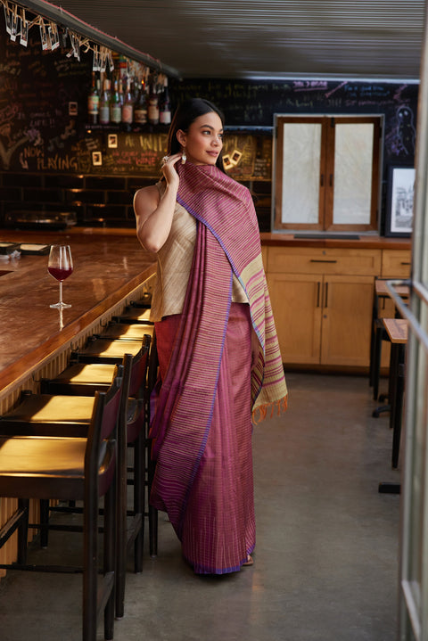
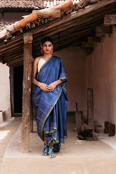
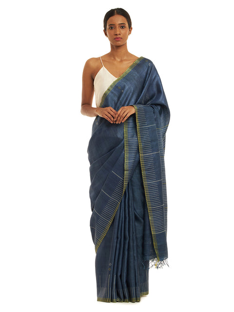
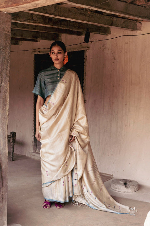
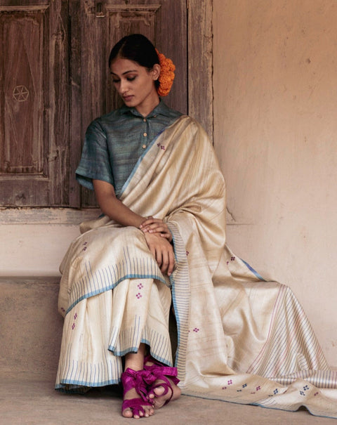
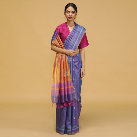
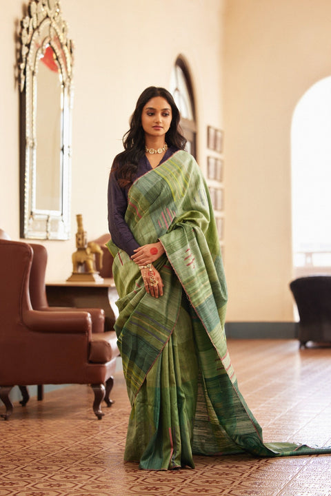
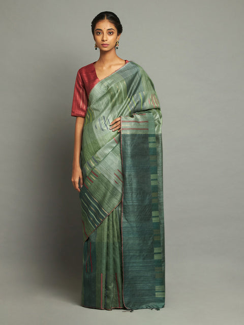
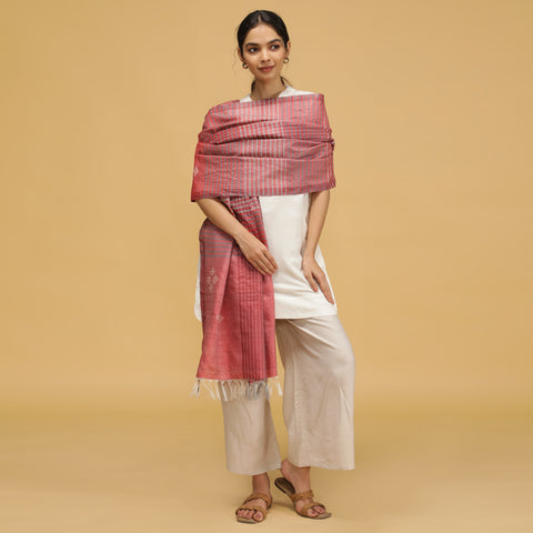
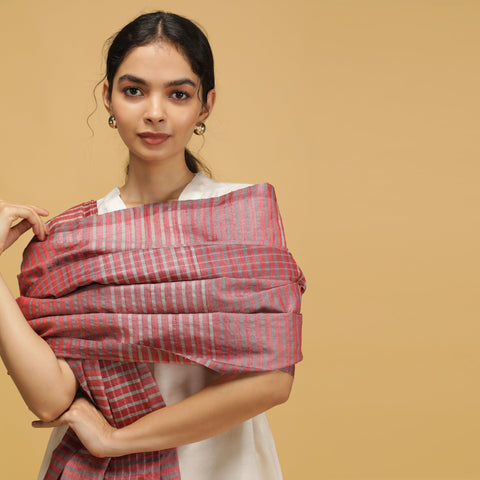
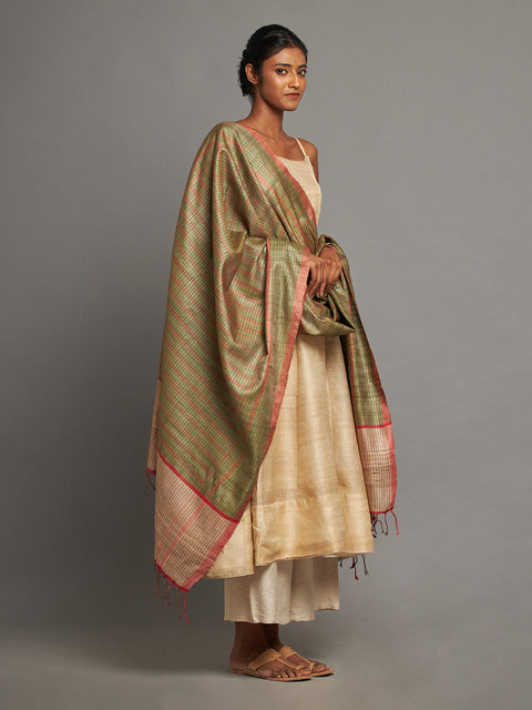
A saree's travel-worthiness usually comes down to how forgiving the weave is under pressure, which is exactly where Kosa silk's natural slub texture works in its favour rather than against it. Kosala's sarees hold their pleats without turning stiff, so a fold settles rather than scars the fabric.
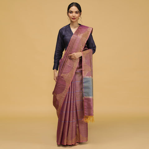
If you're packing for a wedding away from home, the same care applies to wedding silk sarees with heavier borders. And for everyday travel, Kosa silk sarees with a lighter weave are the easiest to roll and carry without a second thought.
Frequently Asked Questions about Silk Saree Packing Tips
Q1. Should I fold or roll a silk saree for travel?
Roll lightweight or textured silks like Kosa silk. Fold heavier zari silk sarees along their original pleat lines to protect the metallic thread from distortion.
Q2. How much tissue paper do I need to pack a silk saree?
Two sheets are usually enough, one at the pallu where pleats are deepest, one along the border where zari or embroidery sits.
Q3. Is it safe to pack a silk saree in a plastic bag?
No. Plastic traps moisture and can cause discoloration over a long trip. Use a breathable cotton or muslin bag instead.
Q4. Where should a silk saree go in a suitcase?
In the middle layer, away from heavy items or hard-edged objects. The bottom of a suitcase collects the most weight and pressure during travel.
Q5. How do I remove creases from a silk saree after travel?
Hang it in a steamy bathroom for 15 to 20 minutes first. Iron on low heat with a pressing cloth only if needed, and keep heat off any zari sections.
Q6. Why do silk sarees crease more than other fabrics?
Silk fibres don't recover from pressure as quickly as cotton or linen. A saree's unstitched length also means one fold creates a pressure line across the whole fabric, not just a section, and party wear silk sarees with denser weaves feel this the most.
Learn More