Why do some saree looks feel balanced while others feel incomplete? The difference often comes down to styling choices beyond the saree itself.
For Sonam Kapoor, the saree is only the starting point. It's the belt, the jacket, or the blouse she pairs with it, and the fact that she never adds all three at once.
That balance is what makes her saree styling easier to adapt for weddings, receptions, and formal occasions. This piece breaks it down into the choices behind Sonam Kapoor’s saree styling choices, so you can borrow the logic without needing her wardrobe.
What Makes Sonam Kapoor's Saree Style Different?
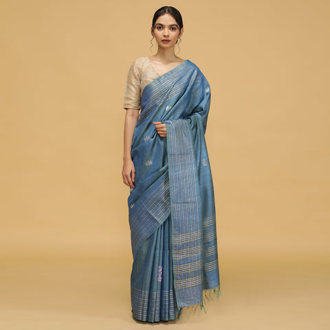
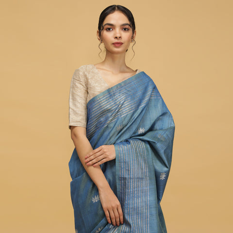
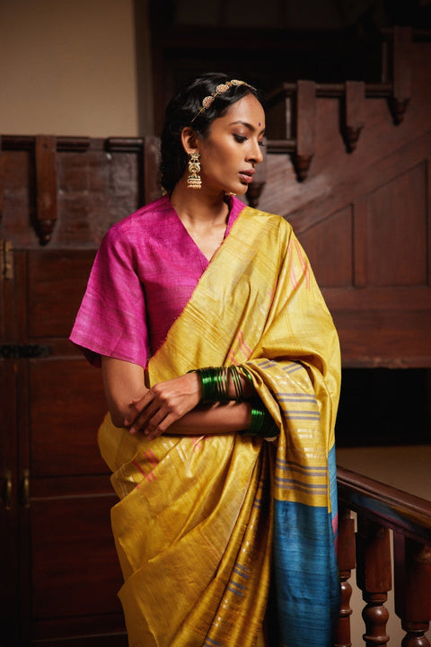
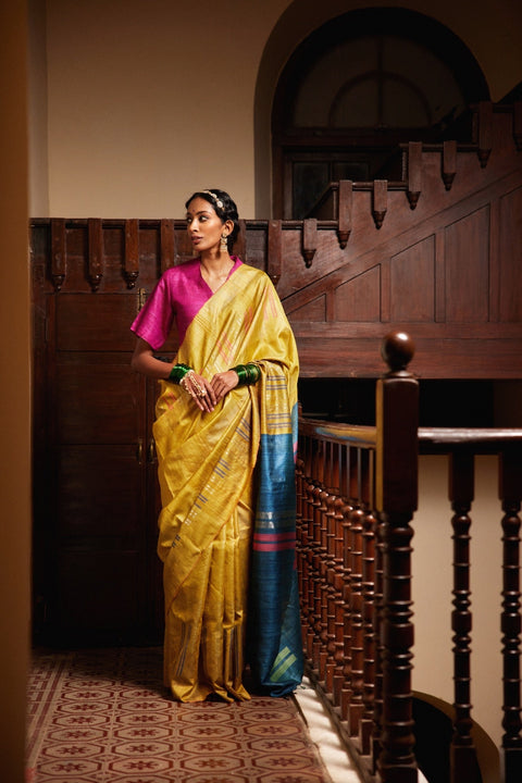
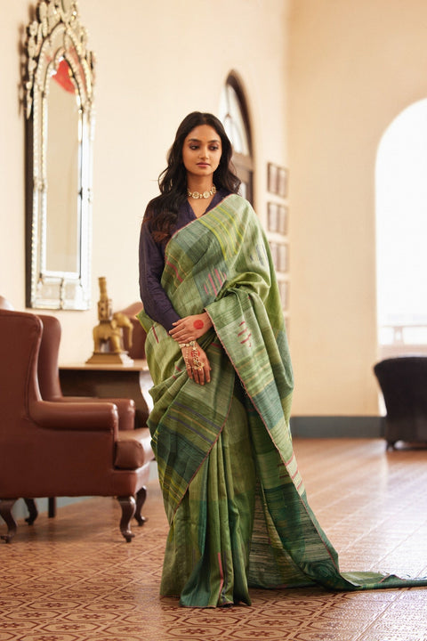
The Sonam Kapoor saree look works because she treats the saree as one part of an outfit rather than the entire look. After choosing the saree, she makes one styling decision, whether it is a belt, jacket, cape, or a different drape, to change the overall silhouette.
She does not rely only on the blouse and pallu. Instead, she balances the saree with one added element and chooses the drape based on the occasion. Her styling often follows a simple approach:
She treats the saree as the foundation and builds the rest of the look around it.
She adds one structured piece, such as a belt, jacket, or cape.
She chooses the drape based on the event and setting.
She allows one element, such as the blouse or jacket, to become the main focus.
She keeps prints and embellishments balanced so one element stands out.
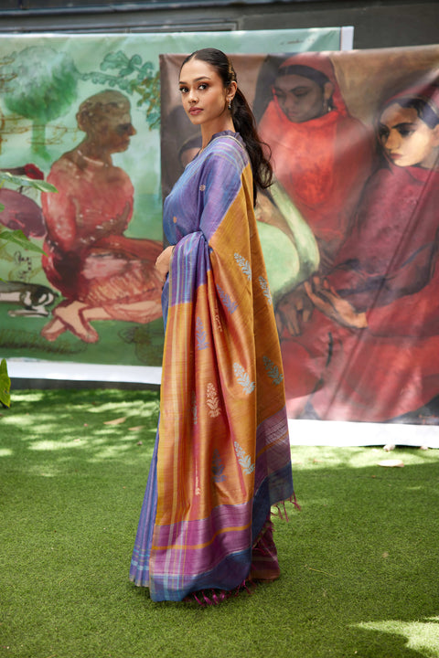
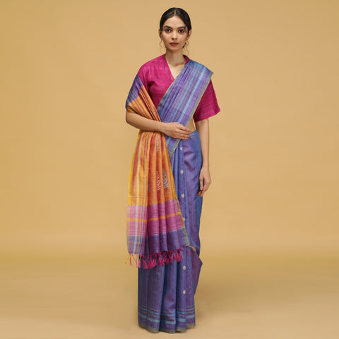
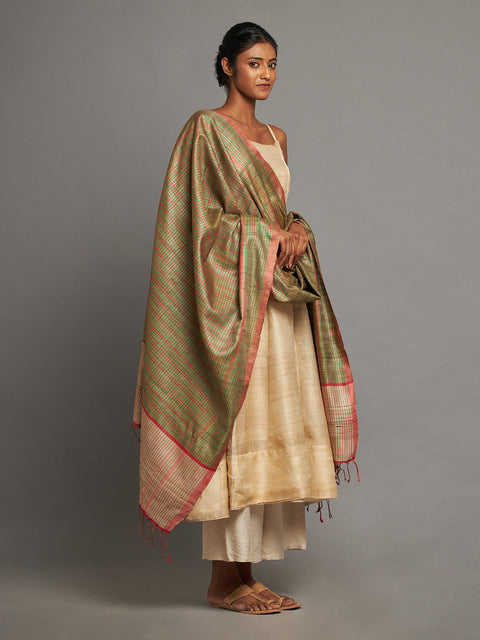
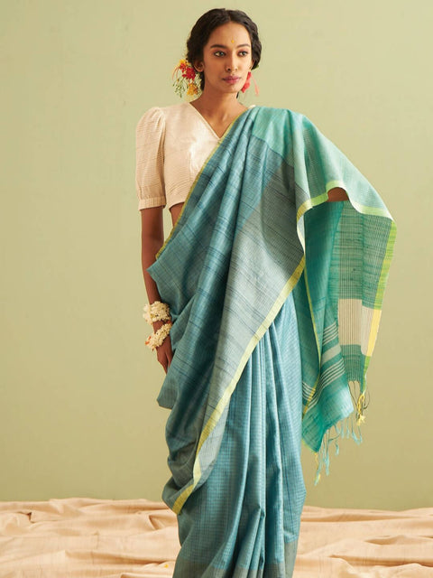
Her draping choices also change with the occasion. She moves between classic Nivi pleats for a structured silhouette, one-shoulder pallu styles for a relaxed evening look, dhoti-style drapes for a contemporary shape, and pre-draped styles when ease of movement matters.
The idea is not to copy every detail of her wardrobe. It is to understand the balance behind each look: one strong styling choice, supported by the right drape, blouse, and occasion.
How Do You Build a Structured Saree Look Like Hers?
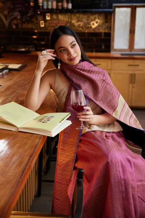
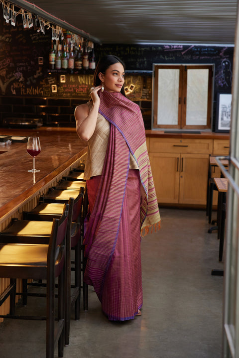
The most visible version of that one decision is what goes on top of the drape. A thin belt cinched at the waist holds the pleats in place and adds shape without changing the drape itself.
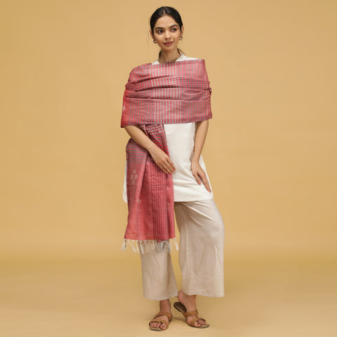
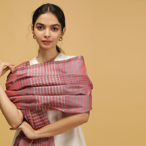
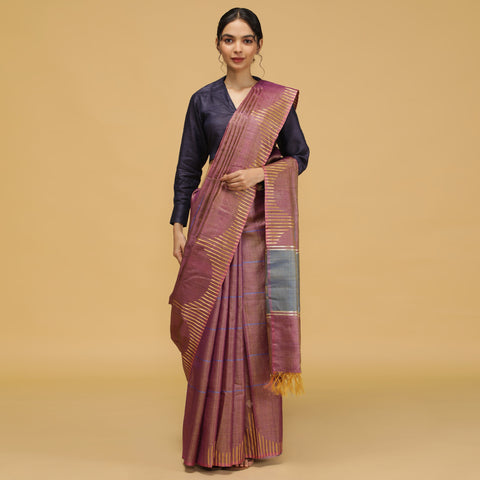
A cropped jacket adds structure from the shoulders down, and a draped silk stole does the same job with less weight, which makes it easier to wear through a long event. The same instinct behind draping a silk saree well in the first place carries through here; structure holds up better than volume.
A belt at the natural waist for a defined waistline
A cropped jacket over one shoulder for structure without bulk
A stole draped like a cape for a softer version of the same idea
A contrast blouse showing through the layer for a finished edge
Whichever piece you add, everything else, from the blouse to the jewellery, should support it instead of competing with it.
Which Blouse Choices Carry the Look?
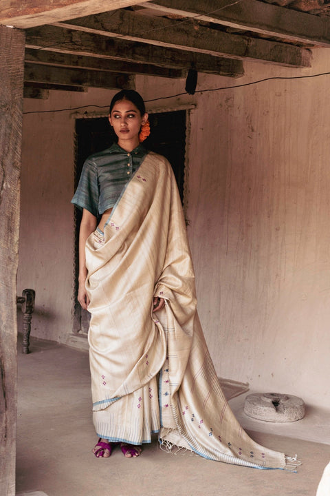
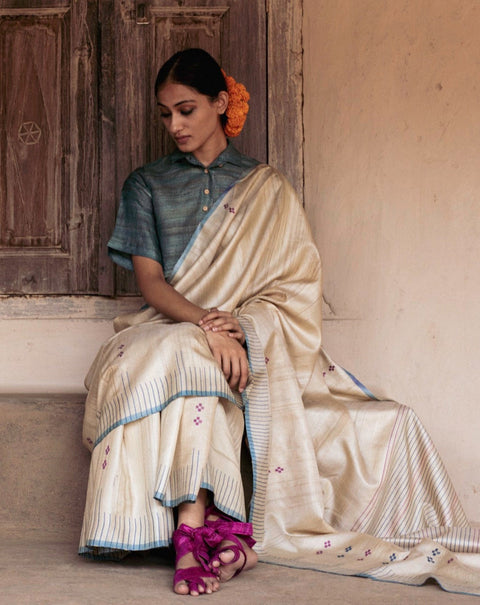
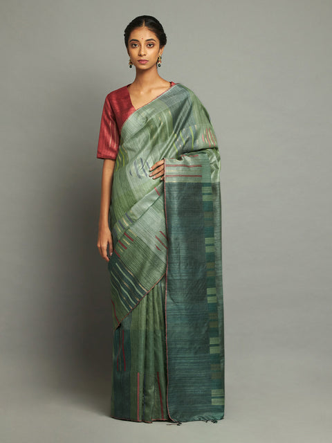
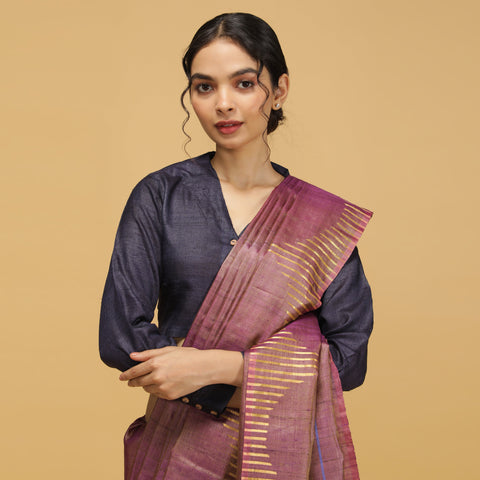
Once the layering piece is chosen, the blouse decides whether the whole thing reads as intentional. Strong sleeves, a corset fit, or a high neck give the outfit its shape before any jacket or belt goes on.
A very simple blouse may lose visibility when paired with a strong outer layer. A blouse with a defined silhouette holds its own even when it is mostly covered, and shows through in a way that reads as considered. A structured neckline also usually calls for simpler jewellery with silk sarees, since the blouse is already doing the visual work.
Corset-style blouses for a defined waist under a jacket
High-neck blouses that hold shape without needing a dupatta
Statement-sleeve blouses that show even when partly layered
Cropped blouses for cleaner lines when a belt is worn low
How Do You Wear This Off the Red Carpet?
The idea behind a Sonam Kapoor saree look is not to copy the exact outfit, but to understand how each element works together. The saree, blouse, drape, and added layer should each have a clear role.
Start with one main styling choice: Choose what you want to highlight first, whether it is a structured jacket, a belt at the waist, or a detailed blouse. The rest of the look should support that choice.
Balance the layers: A jacket can add shape to a simple silk saree, while a strong blouse can create the same impact without extra layers. Avoid adding multiple statement pieces that compete with each other.
Style according to the occasion: For weddings and formal events, a structured saree with one thoughtful addition creates a polished look while keeping the focus on the drape.
Know when to stop: If the jacket or cape is the highlight, keep jewellery lighter. If the blouse has detailed sleeves or embroidery, let it remain the main feature and skip the belt.
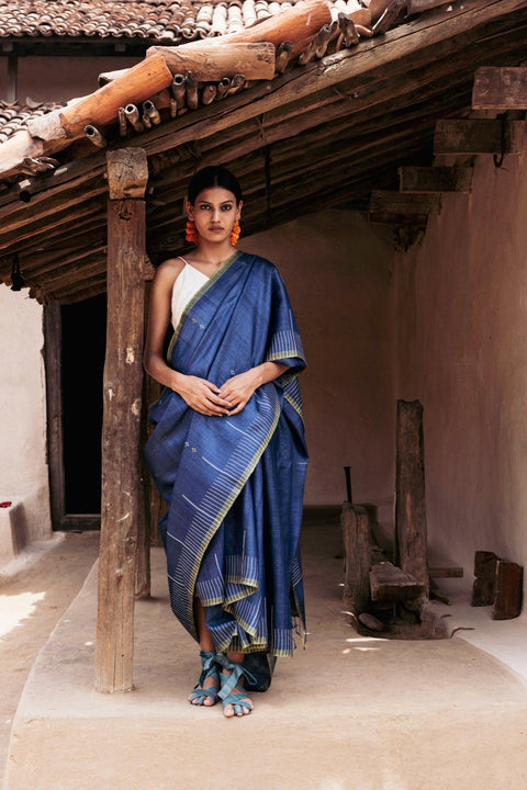
This approach works especially well with wedding silk sarees because a saree with good structure already holds the silhouette. One considered styling choice is often enough to make the look feel complete.
What Kind of Saree Actually Holds This Look?
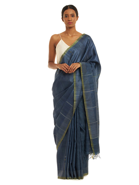
Layering, different drapes, and blouse details work best when the saree itself has enough structure. A saree with more body usually holds pleats and added layers better during longer events.
A saree with good body holds pleats and structure through a full evening, which is what this kind of styling actually needs. Once the base fabric holds its own, the belt, the jacket, or the cape stops being a fix and becomes a finishing choice.
Conclusion
Kosala sarees are built to hold up under exactly this kind of styling, with pleats that stay put and structure that carries through a full evening.
A saree does not need to be reinvented to feel current. It needs one considered layer and a blouse that pulls its weight.
That is the real lesson behind Sonam Kapoor's styling choices, not imitation, but intention. Once you know which single element to add, the rest of the look tends to fall into place on its own.
How to Dress Like Sonam Kapoor: Frequently Asked Questions
1. What makes a Sonam Kapoor saree look different from a regular saree look?
It adds one structured layer, a belt, jacket, or cape, over a traditional drape. The saree stays classic while the added piece changes the silhouette and makes the look feel current.
2. Can you recreate a Sonam Kapoor saree look with a saree you already own?
Yes. Any saree with enough body to hold pleats works. Add a thin belt or a short jacket over the drape, and keep the jewellery minimal so the added layer stands out.
3. Which blouse styles work best for a Sonam Kapoor saree look?
Structured blouses with strong sleeves, high necks, or a corset-style fit work best. They carry visual weight on their own, which matters once a jacket or belt sits over the saree.
4. Does a Sonam Kapoor saree look work for weddings or only red carpet events?
It works for both. For weddings, keep the layering piece simple and let the fabric do the work. Bold layering suits evening events better than daytime family functions.
5. Is Kosa silk suitable for this kind of layered saree styling?
Yes. Kosala Kosa silk holds pleats and structure well, which supports a belt or jacket without losing shape. That structure is essential for this style of dressing.
6. How do I avoid the look feeling overdone?
Choose one dramatic element only, either the layering piece or the blouse. Keep jewellery and hair simple so the outfit does not compete with itself.
Learn More