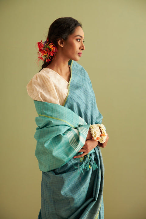
Since ancient times, colour has been deeply intertwined with India's cultural and spiritual heritage. Beyond mere aesthetics, these vivid hues carry profound meanings, connecting generations through rituals, traditions, and timeless narratives. Poet Amīr Khusrau beautifully expressed the profound connection between colour and the human spirit in his verse:
"Colourful, come and paint me in your own hue.
You are my lord, Beloved of God.
Dye my veil and my lover’s turban with the colours of spring.
You are my lord, Beloved of God. As the price you demand for the pigment,
accept the payment of my flowering youth."
Tradition That Endures Through Time
For over 4,000 years, India’s artisans have worked in harmony with nature, perfecting the art of dyeing. From the Indus Valley Civilization to today, fabrics have been infused with natural hues—deep indigo, haritaki black, and manjistha red—each representing the eternal dance of earth and sky, permanence and transformation. Ancient Chinese scholars praised Indian textiles, calling them ‘sunrise cloud cottons’, for their remarkably enduring colours.
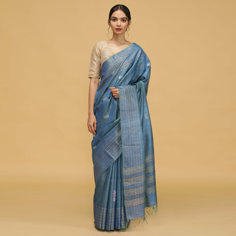
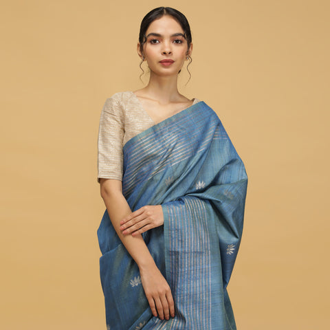
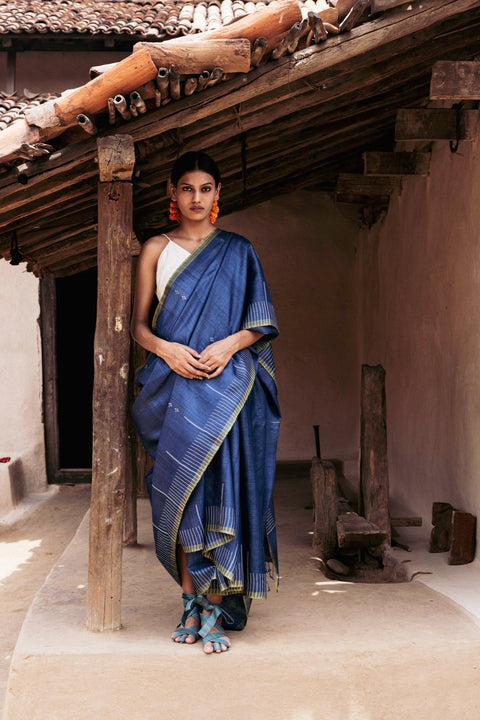
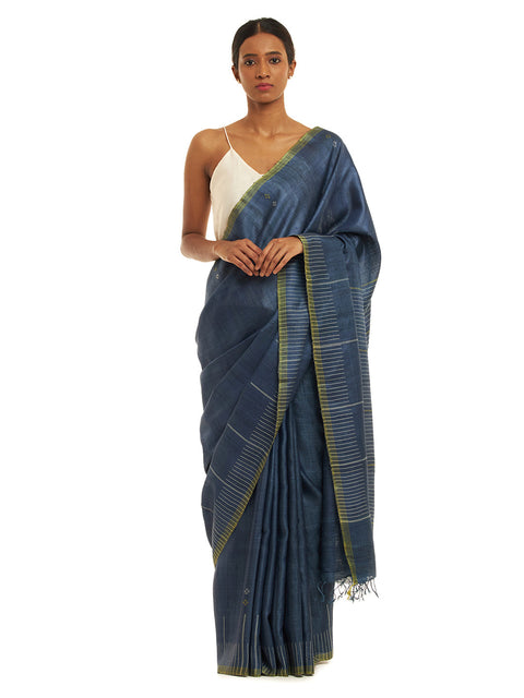
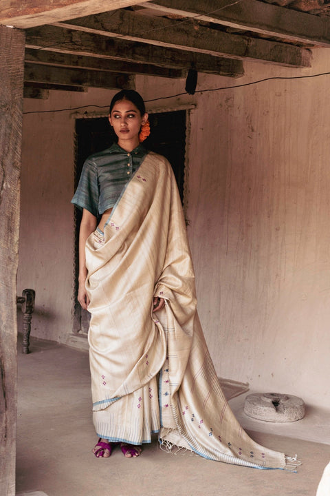
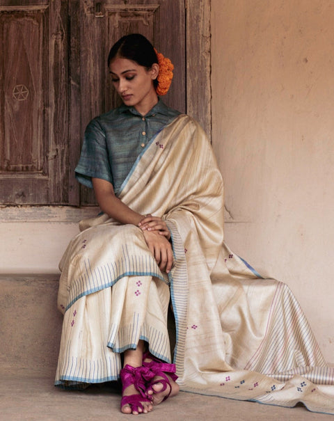
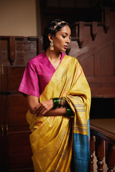
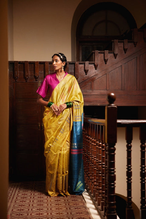
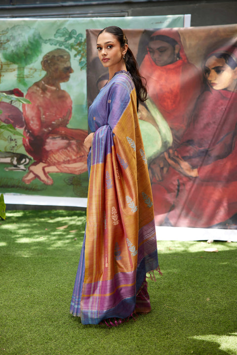
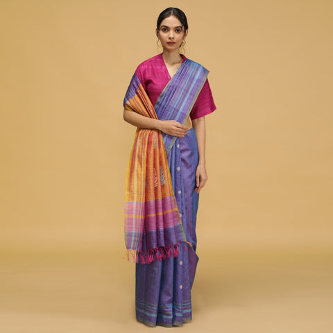
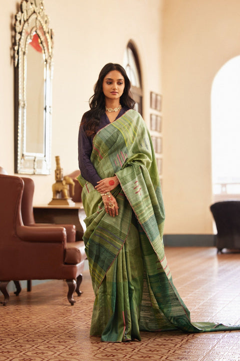
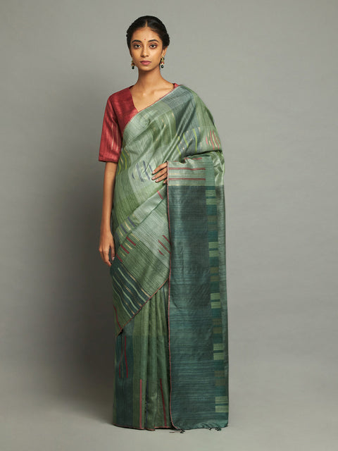
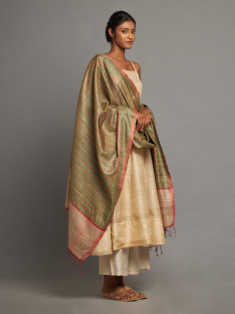
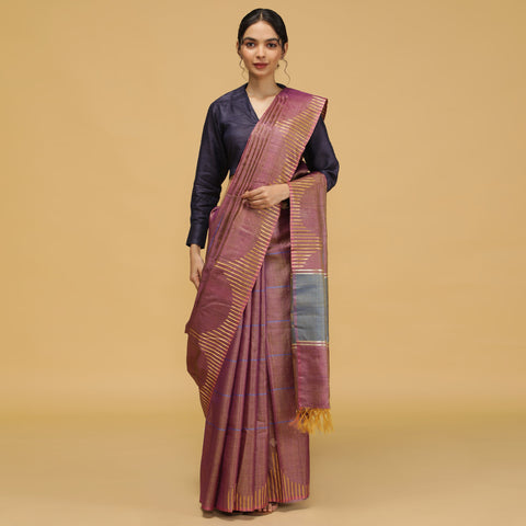
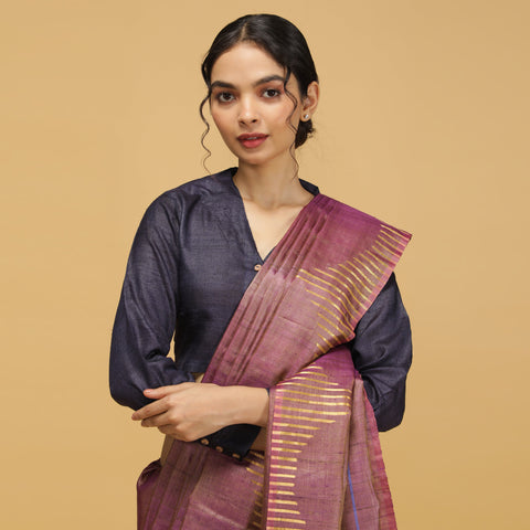
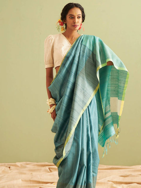
This mastery was never a passing craft; it became an integral part of India's textile heritage. European travellers marvelled at the extraordinary resilience of Indian fabrics, which outlasted even their highest expectations. The country’s dyeing techniques were not solely about beauty—they intertwined with everyday life. Haritaki black was revered in Ayurveda, turmeric illuminated both textiles and cuisine, and henna adorned hands in celebration. The tribal communities of Bastar and Koraput, Odisha, wove their identity into deep red sarees and turbans, dyed using the rich hues of Aal mulberry. A Kosa silk saree, known for its rich texture and natural sheen, is a timeless symbol of elegance and heritage, crafted from the finest silk sourced from Central India. Every piece of cloth, naturally dyed and handwoven, carried the legacy of ancestors who lived in balance with nature.
Aakaar: Honouring Ancestral Wisdom in Modern Fashion
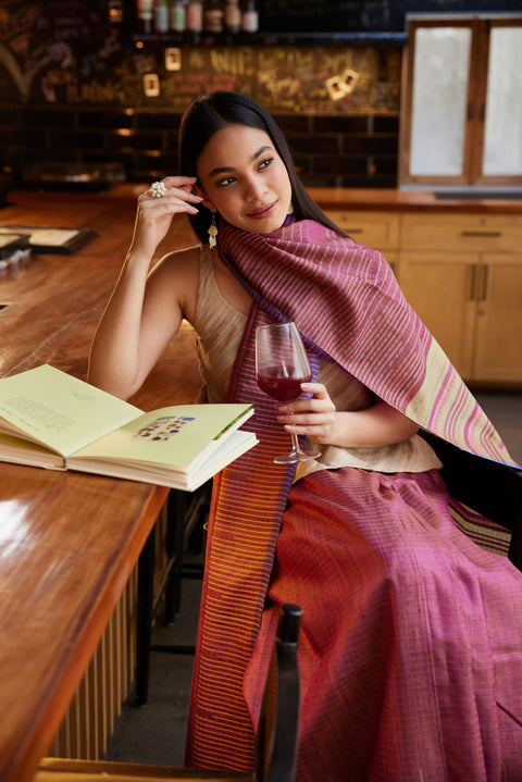
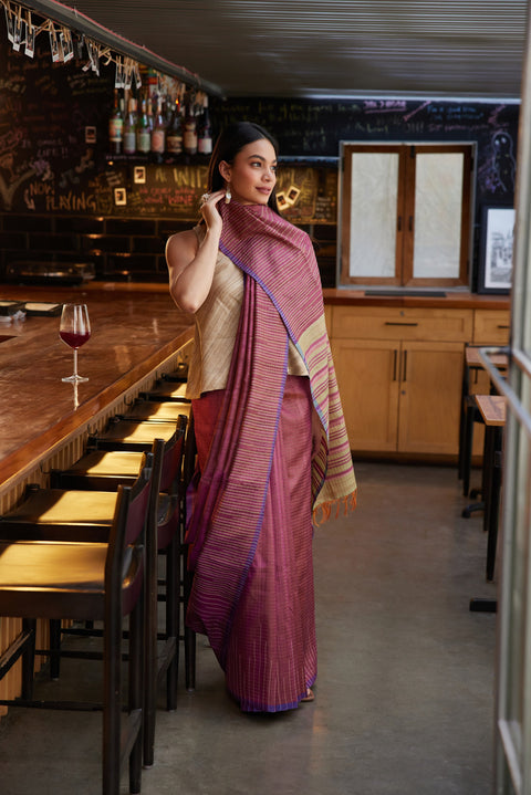
Kosala’s Aakaar collection embraces this age-old tradition, bringing the essence of natural dyeing into contemporary Indian ethnic wear for men. Every fabric in this collection is dyed with plant-based ingredients like indigo, alum, turmeric, Himalayan rhubarb, and madder—celebrating sustainability as a way of life, not a fleeting trend. The process is slow and intentional, echoing the wisdom of generations before us. From gathering roots, flowers, and minerals to preparing dye baths and submerging fabrics, every step is an act of craftsmanship.
A Tribute to Nature and Heritage
Just like nature itself, these colours evolve over time. A naturally dyed garment may subtly change, much like petals fading under the sun, or carry the lingering scent of the plants used in its creation. Each piece is more than just clothing—it is a story, a conversation between the wearer and the earth.
Much like the artisans who weave pure Kosa silk sarees and handloom silk sarees with devotion, Aakaar invites you to embrace the art of slow fashion. Wear a piece of nature, honour centuries of tradition, and become part of a timeless dialogue between craft and sustainability.
Nitin Dixit is the Marketing Head at Kosala, where he works closely with customer insights, product positioning, and emerging fashion trends. Drawing from his hands-on experience in the ethnic fashion industry, he writes about Indian ethnic wear, wedding fashion, styling, fabrics, craftsmanship, and evolving consumer preferences across traditional and contemporary apparel.
You unzip the suitcase the morning of the wedding and pull out a saree that looks nothing like the one you packed. Sharp fold lines run across the pallu. The border has a crease so deep it won't sit flat even after an hour of steaming.
This is the moment most saree packing tips floating around online fail to prevent, because they treat every silk saree the same way.
They aren't the same. And the fix starts with understanding why silk behaves the way it does in a suitcase.
Should You Fold or Roll a Silk Saree?
Not every silk saree should be packed the same way. The right call depends on weight and weave. The Tissue-Interleave method is where most saree packing tips get vague.
Here's the exact placement that actually protects the fabric.
Lay the saree flat, right side down, on a clean surface.
Smooth out any existing creases by hand before you fold anything.
Place one sheet of tissue paper at the pallu, where the pleats are deepest.
Fold lengthwise along the saree's natural pleat lines, not new ones.
Slide a second sheet of tissue along the border, where zari or embroidery sits.
Roll or fold the full length based on the weight rule above.
Slip the finished roll or fold into a breathable cotton bag, never plastic. Plastic traps moisture and can cause the colour to shift over a long trip.
Pack a Small Saree Emergency Kit
Tissue paper solves the fold. It doesn't solve everything else that can go wrong between home and the venue.
Safety pins: for a pallu that won't sit right or a pleat that loosens mid-event
Fashion tape: keeps the pallu in place without needing a pin near delicate zari
A small stain remover pen or wipe: for oil or food marks that happen at the function itself
A compact sewing kit: a loose thread or a small tear at the border is easier to fix on the spot than to explain later
A travel-size wrinkle spray: not a substitute for good packing, but useful for last-minute touch-ups before you're dressed
Blotting paper: for humid destinations where sweat or moisture near the blouse edge can transfer onto the saree
Keep all of this alongside the saree, not scattered across your suitcase. When something goes wrong an hour before the event, you don't want to be searching for it.
Does Your Luggage Choice Matter Too?
The suitcase itself plays a bigger role than most people account for.
Hard-shell luggage holds its shape under weight, so the middle layer where your saree sits stays flat instead of bowing inward when the case is stacked or squeezed into an overhead bin
Soft-sided bags flex more, which means more pressure can transfer through to whatever's packed inside, saree included
A structured cabin bag is worth using if you're travelling with just one or two sarees for a short trip. It sees less handling than checked luggage and keeps the saree closer to how you packed it
Avoid packing the saree in an outer or side pocket. These compress the most during transit and rarely stay flat
If you're choosing between two suitcases for a trip built around a wedding, the one with a firmer shell is usually the safer bet for anything silk.
Packing for Multi-Function Weddings
If the trip covers more than one function, sarees for mehendi, sarees for haldi, sangeet, and the ceremony itself, packing every saree the same way in one pile makes the morning of each event harder than it needs to be.
Pack by function, not by saree type: Group each saree with its matching blouse, jewellery, and any dupatta or stole for that specific event.
Label each bundle: Use a small tag or sticky note, especially if you're carrying four or five sarees for a multi-day wedding.
Pack the earliest function's saree closest to the top: This is essential so that you don’t end up unpacking everything the morning of mehendi to find it.
This isn't about complicated organizing. It just saves you from unfolding and refolding sarees you don't need yet, which is its own source of unnecessary creasing.
Packing for Humid vs Dry Destinations
Climate changes what "creasing" actually looks like at the other end, and this is something almost none of the standard saree packing tips account for.
Humid destinations (coastal weddings, monsoon travel): silk absorbs moisture from the air, which softens fold lines but can also cause the fabric to feel limp or slightly sticky. Pack an extra layer of tissue and unpack the saree the moment you arrive, so it isn't sitting damp in the bag.
Dry destinations (hill stations, winter travel): fabric holds its fold lines more stubbornly in low humidity. A light steam on arrival works faster here than in humid conditions.
If It Still Creases on Arrival
Even with careful silk saree travel prep, a long journey can leave marks. Here's what actually works, and what to skip.
Hang the saree on a padded hanger in a steamy bathroom for 15 to 20 minutes. The steam relaxes the fibers without direct heat contact.
If you need to iron, use a pressing cloth between the iron and the fabric, and keep the setting low. Never run direct heat over zari, it can dull or discolour the metallic thread.
Avoid pulling the fabric taut to "stretch out" a crease. That can distort the weave instead of releasing it.
If the crease is only in the pleats, a gentle re-drape often settles it better than ironing.
Kosa Silk and the Travel Test
A saree's travel-worthiness usually comes down to how forgiving the weave is under pressure, which is exactly where Kosa silk's natural slub texture works in its favour rather than against it. Kosala's sarees hold their pleats without turning stiff, so a fold settles rather than scars the fabric.
If you're packing for a wedding away from home, the same care applies to wedding silk sarees with heavier borders. And for everyday travel, Kosa silk sarees with a lighter weave are the easiest to roll and carry without a second thought.
Frequently Asked Questions about Silk Saree Packing Tips
Q1. Should I fold or roll a silk saree for travel?
Roll lightweight or textured silks like Kosa silk. Fold heavier zari silk sarees along their original pleat lines to protect the metallic thread from distortion.
Q2. How much tissue paper do I need to pack a silk saree?
Two sheets are usually enough, one at the pallu where pleats are deepest, one along the border where zari or embroidery sits.
Q3. Is it safe to pack a silk saree in a plastic bag?
No. Plastic traps moisture and can cause discoloration over a long trip. Use a breathable cotton or muslin bag instead.
Q4. Where should a silk saree go in a suitcase?
In the middle layer, away from heavy items or hard-edged objects. The bottom of a suitcase collects the most weight and pressure during travel.
Q5. How do I remove creases from a silk saree after travel?
Hang it in a steamy bathroom for 15 to 20 minutes first. Iron on low heat with a pressing cloth only if needed, and keep heat off any zari sections.
Q6. Why do silk sarees crease more than other fabrics?
Silk fibres don't recover from pressure as quickly as cotton or linen. A saree's unstitched length also means one fold creates a pressure line across the whole fabric, not just a section, and party wear silk sarees with denser weaves feel this the most.
A sofa can look unfinished with no cushions, but adding too many colours can quickly create the opposite problem. Several individually attractive cushions do not always make one well-styled sofa.
When thinking about how to style cushions on a sofa, the aim is not to make every cushion match. The colours, textures, and sizes simply need enough connection to make the arrangement feel intentional.
Repeating one shade, introducing controlled contrast, or using texture instead of another colour can create that balance without making the sofa feel crowded.
Best Pairings for How to Style Cushions on Sofa
You do not need a different colour for every cushion. Two or three related shades are usually easier to balance than several unrelated ones.
Start with a simple palette:
Base colour: Use the sofa or dominant neutral in the room.
Supporting shade: Choose a colour that complements the base.
Accent colour: Add one deeper or brighter shade in a smaller amount.
Repeated tone: Repeat one colour to connect the cushions.
Texture: Add variation through fabric rather than another shade.
For example, a beige sofa can work with ivory, rust, and deep green. The cushions are different, but the palette still feels connected.
This also gives handcrafted Kosa silk cushion covers enough room to show their texture without competing with too many colours.
Avoiding Clutter When You Style Cushions on Sofa
The easiest combinations begin with the sofa colour. Treat it as the first shade in the palette and build around it.
Sofa Colour
Cushion Combination
Overall Effect
Beige
Rust + ivory + olive
Warm and earthy
Grey
Navy + beige + muted gold
Balanced and refined
Cream
Sage + brown + natural beige
Soft and organic
Brown
Mustard + cream + deep green
Rich and grounded
Navy
Beige + rust + muted gold
Warm contrast
White
Charcoal + olive + beige
Clean and contemporary
These are starting points rather than fixed rules. Decide first whether you want the room to feel warm, calm, earthy, or contemporary.
When learning how to style cushions on sofa, look for a connection between shades through similar undertones, repeated neutrals, or colours already used elsewhere in the room.
Mixing Shades in How to Style Cushions on Sofa
A sofa starts to look busy when every cushion tries to become the focal point. Strong colour, bold prints, texture, tassels, and contrasting piping can all work, but not necessarily together.
Use one element as the lead:
Strong colour: Keep patterns quieter.
Detailed weave: Use simpler shades around it.
Patterned cushion: Repeat colours from the pattern elsewhere.
Colourful sofa: Choose neutral or tonal cushions.
Minimal room: Add one stronger accent rather than several.
Statement cushion: Let the others support it.
One deep rust cushion, for example, can sit beside beige and ivory cushions. The rust creates contrast while the neutral shades keep the arrangement grounded.
Texture can also add interest without another colour. Pairing a visibly woven cushion with a smoother one creates depth while keeping the palette controlled.
Using Texture to Style Cushions on Sofa
Cushions do not need to match the sofa exactly. Using only one shade can feel flat, while relying entirely on contrast can make the arrangement feel disconnected.
Instead, combine:
Tonal shades: Beige with ivory, cream, or sand.
Neutral colours: Brown, charcoal, or natural tones.
Accent shades: Rust, olive, navy, or muted gold.
For a cream sofa, try one ivory cushion, one muted green cushion, and one rust cushion. Ivory creates continuity, while green and rust add contrast.
You can also repeat one cushion colour elsewhere in your home decor, such as in artwork, a rug, or a table runner. This helps the sofa connect with the rest of the room.
Placement Tips for How to Style Cushions on Sofa
Colour is only one part of a cushion arrangement. If every cushion has the same fabric, finish, shape, and colour intensity, even a good palette can feel flat.
Texture lets you create visual variety without continually adding new colours:
Smooth + textured: Place a simple cushion beside one with a visible weave.
Matte + subtle sheen: Different finishes can make similar colours feel more layered.
Plain + patterned: Use one pattern as the focal point instead of repeating several.
Light + dark tones: Stay within one colour family while creating depth.
Square + lumbar shapes: Change proportion without introducing another shade.
Fine + heavier weave: Small fabric differences can make neutral cushions feel more distinctive.
Handcrafted textiles work particularly well because the weave itself creates visual variation.
This is an important part of how to style cushions on sofa without adding more colours. Beige, rust, and ivory can still feel layered when the cushions use different textures and finishes.
Creating Balance When You Style Cushions on Sofa
Placement matters once the palette is decided. The goal is to make the sofa look balanced without making it feel overly arranged.
A simple approach is:
Place larger cushions towards the outer corners.
Bring stronger colours closer to the centre.
Use one patterned or textured cushion as the focal point.
Mix cushion sizes.
Leave some sofa surface visible.
Balance both sides without making them identical.
For a three-seater sofa, three to five cushions are often enough. Larger neutral cushions can anchor the arrangement while smaller accent cushions introduce colour or texture.
The aim is not to cover the sofa. Cushions should add comfort, colour, and rhythm while still allowing the furniture itself to remain visible.
How to Style Cushions on Sofa for a Balanced Final Look?
A well-styled sofa does not need cushions in every available colour. Start with a controlled palette, then create variation through texture, shape, and one or two accent shades.
At Kosala, handcrafted textiles bring visible weave and colour into contemporary interiors. Understanding how to style cushions on sofa is less about perfect matching and more about creating enough connection between every cushion so the arrangement feels balanced rather than crowded.
Frequently Asked Questions About How to Style Cushions on Sofa
Q1. How many cushion colours should I use on one sofa?
Two or three related colours are usually enough. Start with one base shade, add a supporting colour, and introduce one stronger accent for visual interest.
Q2. Should cushions match the sofa colour?
Not exactly. Combine a tonal shade with complementary neutrals and one controlled accent colour to create depth while keeping the cushions connected to the sofa.
Q3. What cushion colours look good on a beige sofa?
Beige works well with rust, olive, ivory, muted gold, brown, and deep green. Choose two or three complementary shades instead of using every colour together.
Q4. How should I mix patterned and plain cushions?
Use one patterned cushion as the focal point, then choose plain cushions that repeat colours found within the pattern to keep the overall arrangement visually connected.
Q5. How can I make sofa cushions look less cluttered?
Limit the colour palette, vary texture instead of constantly adding new shades, use fewer statement cushions, and leave enough visible sofa space between different cushion groups.
Ask someone to name a neutral colour saree and they will say beige, ivory, or grey. Ask them again this year, and rust, terracotta, and warm sand start showing up in the same sentence. That is not a coincidence. It is a shift in what "neutral" is actually built from.
This blog looks at why earthy tones are taking over that role, and what changes for you once they do.
What Actually Counts as a Neutral Colour Saree Now?
A neutral colour saree used to mean one thing: a shade that stayed out of the way. Beige, ivory, off-white, pale grey. Safe, but often flat.
Earthy tones do the same job differently. Terracotta, rust, sand, and warm khaki still sit quietly next to any blouse or jewellery, but they carry more depth than the old palette did. That is because most earthy shades are not created through heavy dyeing. They come closer to a fabric's natural colour range.
Old neutral: beige, ivory, pale grey, off-white
New neutral: rust, terracotta, sand, warm khaki, natural gold-beige
What changed: the palette moved from "flat and safe" to "warm and textured"
In practice, a neutral now needs to hold its own, not just stay in the background.
Why Earthy Tones Are Replacing the Old Neutral Palette
This shift isn't about rust suddenly becoming fashionable. It's fabric-driven: more buyers are choosing handloom over synthetic silk, and handloom doesn't take dye the way mill silk does. Natural fibres like Kosa silk sarees carry warmth and slub texture that synthetic silk can't replicate, so the colour sits inside the weave instead of sitting on top of it.
It's also a mood shift, not just a fabric one:
Grounding: rust, terracotta, and sand mirror soil, clay, and wood, tones the eye reads as settled
Quieter: unlike a bright jewel tone or busy print, earthy shades don't demand attention, which makes them easy to wear all day
Slower dressing: part of a broader shift toward clothes that feel comfortable, not performative
It's really a fabric trend wearing a colour label, and it happens to match how people want to feel while wearing it.
The Fabric Detail Most Guides Skip
Here is what changes the whole conversation: the same colour name does not look the same on every fabric.
Take beige. On a smooth mill silk, beige reads flat and slightly synthetic under indoor light. On a handloom saree with natural slub, that same beige picks up texture and shifts tone depending on the light hitting it. The matte sheen in Kosa silk, for example, softens the colour instead of making it look shiny or plastic.
Weight matters: a lighter weave (around 80-100 gsm) drapes closer to the body and reads softer in earthy tones
Slub matters: visible natural slub breaks up a solid colour so it never looks one-dimensional
Finish matters: matte sheen holds warm tones better than high-gloss silk, which can wash a colour out under bright light
This is why two sarees in the "same" earthy shade can look completely different once you see them in person.
What Actually Makes a Colour "Earthy" vs Just Beige
Not every muted shade is earthy. The distinction comes down to where the colour comes from.
A dyed beige is achieved through a dye bath on any base fabric, silk, cotton, or synthetic. An earthy tone, when it comes from a natural undyed Kosa silk saree, is closer to the fibre's original colour. Undyed Kosa carries a warm gold-beige tone on its own, without any dye added at all.
That difference shows up in daylight. A dyed beige can look slightly cool or grey depending on the dye lot. A naturally toned earthy shade tends to hold a consistent warmth because it is not fighting a dye base. If the occasion or your skin's undertone leans warm, this is the detail that decides which one actually flatters you.
Which Earthy Tone Suits Your Skin Tone?
Not every earthy shade flatters every undertone the same way, and this is usually where "just wear neutral" advice stops short.
Warm undertones: terracotta, rust, and warm khaki sit close to the skin's own warmth and tend to look the most natural
Cool undertones: a lighter sand or warm greige works better than deep rust, which can read slightly heavy against cooler skin
Deeper skin tones: Richer earthy shades like terracotta and deep rust hold their depth well and tend to photograph better than pale beige, which can wash out under flash or bright daylight, the same way certain saree colours for dark skin hold up better in photographs than others
Olive undertones: warm sand and muted gold-beige tend to blend well without looking washed out or overly warm
If the occasion or your skin's undertone leans warm, this is the detail that decides which earthy shade actually flatters you, more than the shade name on a product page ever will.
Styling Neutral Colour Sarees for Everyday Wear
Earthy neutrals work harder than people expect, mainly because they do not compete with anything else you are wearing.
Keep the blouse tonal or one shade darker for a grounded look, or go with a plain contrast like white for daytime wear
Skip heavy embellishment. Earthy tones already carry visual interest through texture, so simple gold or oxidised silver jewellery is usually enough
For everyday sarees, a lighter earthy shade like sand or warm beige holds up better through a full day than a deep rust, which shows creasing sooner
In practice, the styling gets easier the more textured the fabric is. A flat synthetic beige needs more accessorising to avoid looking plain. A textured earthy weave does not.
What to Look for in an Earthy Kosa Silk Saree
If the goal is a neutral colour saree that holds its warmth through the day and photographs consistently, the fabric matters as much as the shade name.
Kosala works with natural, undyed Kosa silk, which means the earthy gold-beige tone many buyers are now looking for is not a dye choice, it is the fabric's own colour. The weave's natural slub and matte sheen are what keep that tone from looking flat under different light. If you are choosing between a dyed neutral and one that comes from the fibre itself, the undyed version tends to hold its warmth more consistently across the day.
Earthy tones are not replacing neutrals as a trend. They are replacing them because the fabric behind them, handloom, natural fibre, minimally dyed, holds up better in daylight, in photographs, and through a full day of wear. Once you look past the colour name and check the weave and finish, the choice becomes a lot clearer.
Frequently Asked Questions about Neutral Colour Sarees
Q: Are earthy tones the same as beige and ivory?
A: No. Beige and ivory are usually achieved through dyeing, while earthy tones like natural gold-beige often come from the fibre's own colour, especially in undyed Kosa silk.
Q: Do earthy tone sarees suit every skin tone?
A: Yes, most earthy tones flatter both warm and cool undertones because they sit between a neutral and a warm shade, making them easy to pair with most jewellery and blouse colours.
Q: Can earthy colour sarees be worn daily, not just for festive occasions?
A: Yes. Lighter earthy shades like sand and warm beige work well for daily wear since they show less creasing and pair easily with simple blouses.
Q: Why does the same beige look different on two sarees?
A: The fabric's weave and finish change how a colour reads. A textured, matte weave like Kosa silk holds warmth differently than a smooth, glossy synthetic silk in the same shade.
Q: Is a naturally undyed saree better than a dyed neutral one?
A: Neither is better outright, but naturally undyed shades tend to hold consistent warmth across different lighting, while dyed neutrals can shift slightly cooler depending on the dye batch.